tl;dr
I was recently perusing several journals in psychology, looking for examples of bad graphics. One would think such an exercise would be quite simple. People are generally really bad at creating graphics.
But the problem was worse than I thought.
Worse than bad graphics, people were not producing graphics at all! Instead, massive tables and test statistics littered their article.
It’s odd, is it not? Humans evolved to be exceptional at visual pattern recognition, and yet we turn off that part of our brain when we do science?
Odd, that.
After grumbling for several weeks, I began to consider why people don’t use graphics. I have two hypotheses:
-
People don’t know what sorts of graphics are appropriate for a given situation.
-
The software just doesn’t exist. I won’t name any names, but SP[redacted]S and S[redacted]S both display graphics that look like they were produced on an Atari. R is excellent (particularly with ggplot2), but the learning curve looks more like a cliff to the uninitiated.
Well that’s where Flexplot fits in. Flexplot was designed to address both problems.
The Guiding Philosophy of Flexplot
I have a colleague who is an expert in human factors, and she has played no small role in my thinking of how Flexplot should work. One of the dominant philosophies in technology design is that the technology needs to “get out of the way,” of the user. If the user is trying to buy a product online, the website should make it as easy as possible for the user to do so. If the user is trying to drive from Place A to Place B, the car shouldn’t put any obstacles in the way.
And yet, when producing graphics, many analysts have the following internal conversations:
hmmm…I want to see if my intervention worked. What plot do I use? Is that a scatterplot? Or no…wait. A qqplot? A histogram? Where’s my stats textbook?…Ah yes, a boxplot. I want a boxplot. Now how do I do that again? Is it under this menu? No. Maybe that menu? Hmmmm… You know what? Screw it. Ellen’s on in an hour. I’ll just report a table.
When creating graphics in SPSS, JMP, Prism, etc., there are way too many obstacles for users to produce graphics. But even if they do produce a graphic, their intellectual resources are so sapped they have nothing left to actually interpret the graph.
That’s where Flexplot comes in. Flexplot removes these obstacles so analysts can be freed to spend their resources doing what they should do: interpreting the findings.
Let me say that again, but in a way that’s much more tweetable
The more resources we spend constructing/deciding on graphics, the less we have to interpret. #Flexplot automates the decision-making so researchers can spend their resources interpreting graphics. #Jamovi.
(I think that’s within twitter’s word limit).
How does Flexplot do it?
So how does Flexplot do it? The user only needs to specify the outcome and the predictor(s).
That’s it.
Well, they may have to decide whether to panel variables, but we’ll talk about that later.
So with that, let me show you how to do some basic graphics in the Flexplot module.
Univariate Distributions
Okay, I kinda lied. I said earlier the user only needs to specify the outcome and the predictor. But that’s not actually true. The user only needs to specify the outcome.
Shame on me.
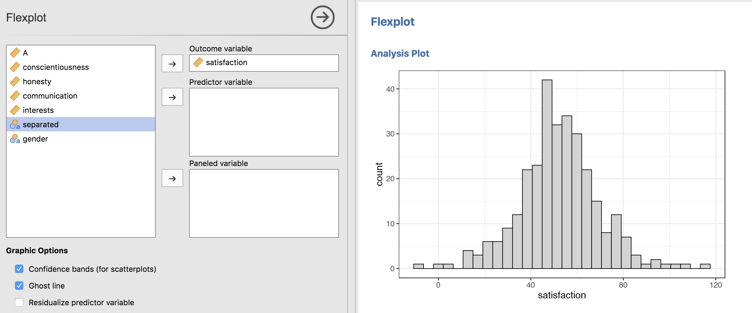
In the background, Flexplot decides whether to plot a histogram (for numeric variables):
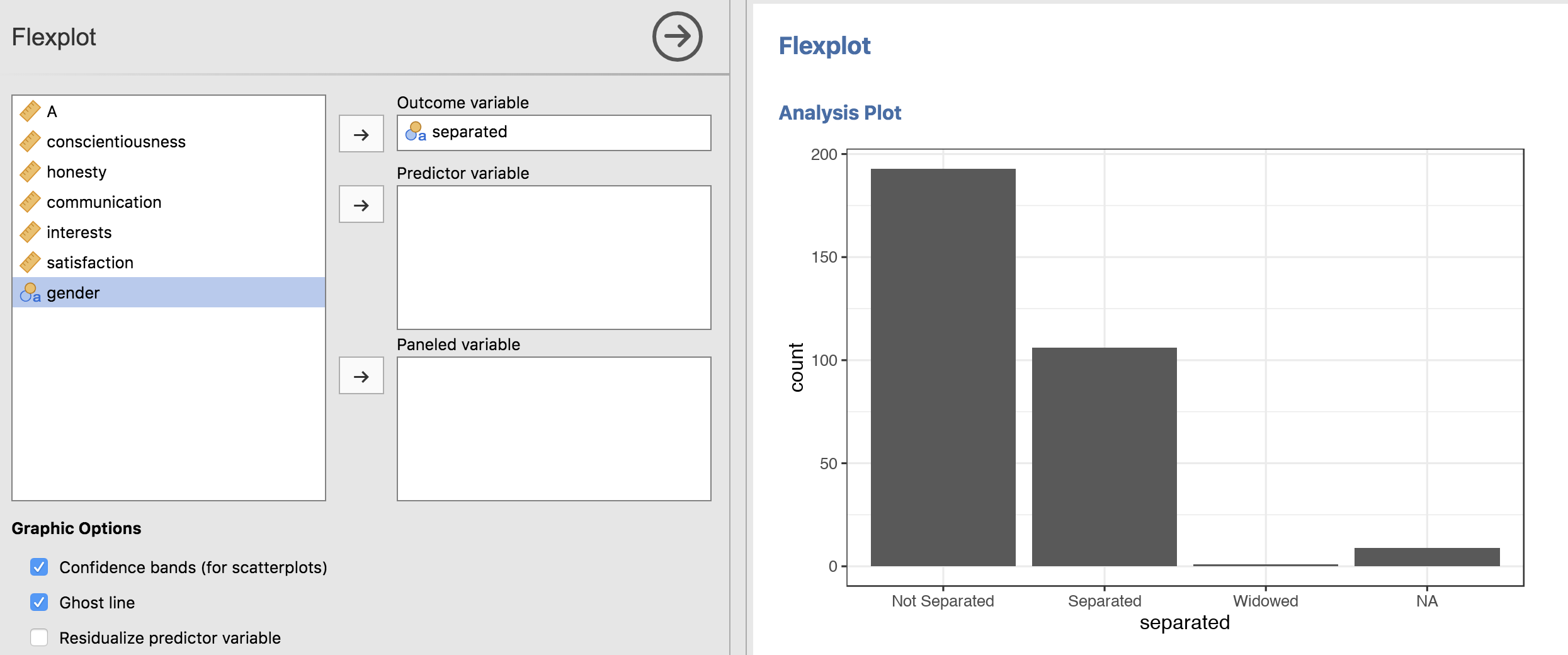
Or a barchart (for categorical variables):
Bivariate Relationships
The indisputed king of graphing numeric by numeric relationships is the scatterplot, which flexplot handles with aplomb:
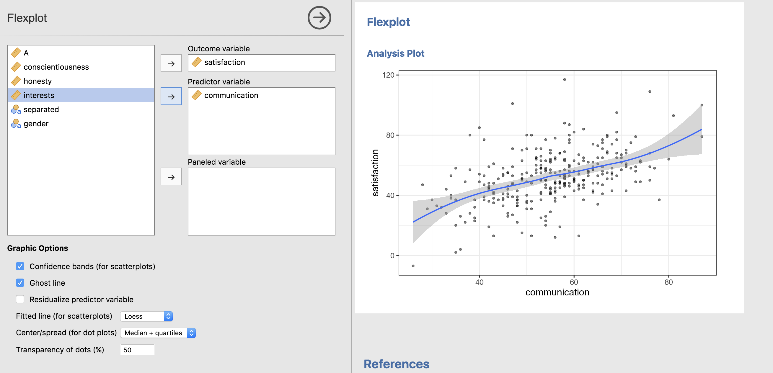
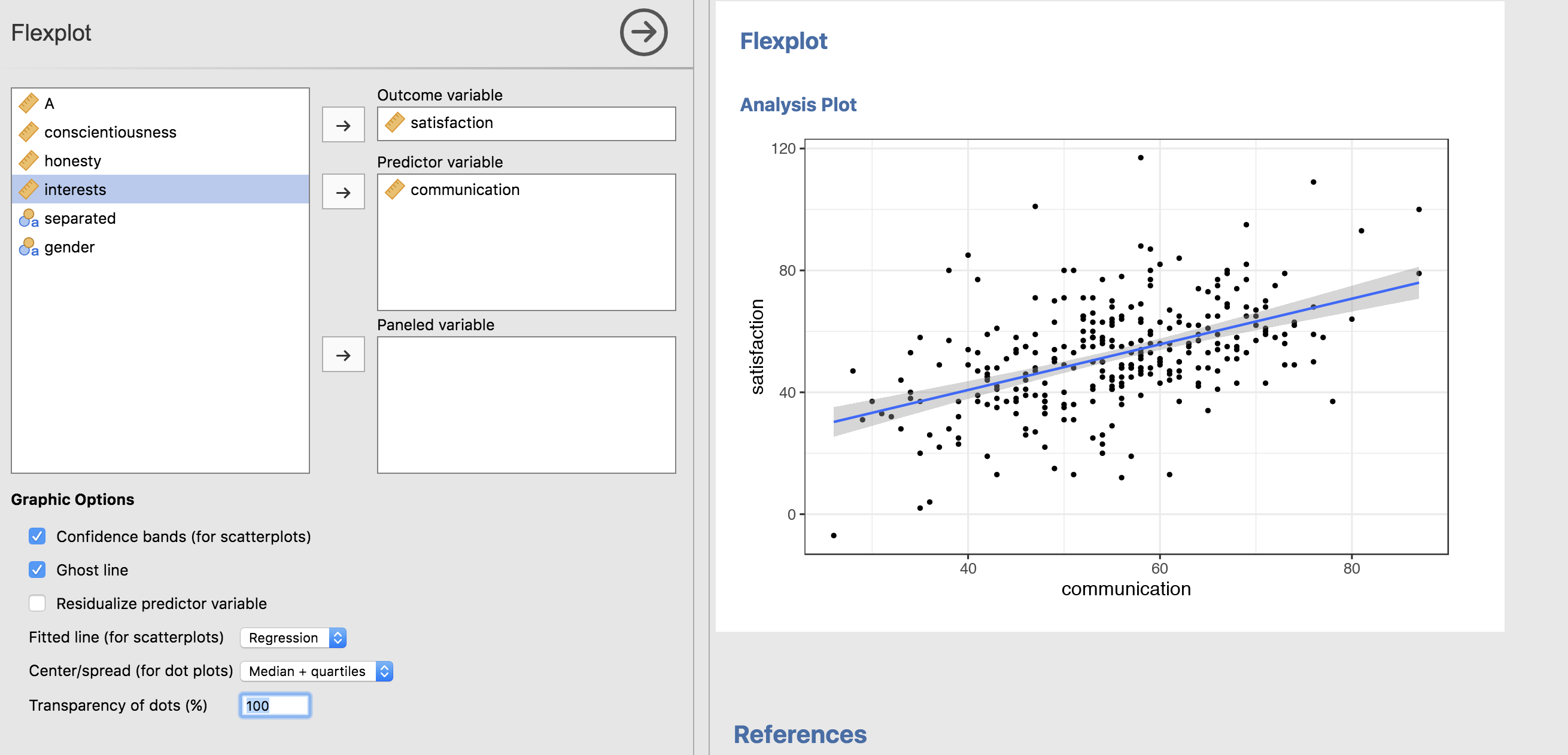
Notice that it defaults to a loess line. That’s intentional. I want to highlight deviations from linearity, just to help the researcher see if the model is appropriate. But, we could always change it to a straight line (and let’s go ahead and make the dots more opaque while we’re at it):
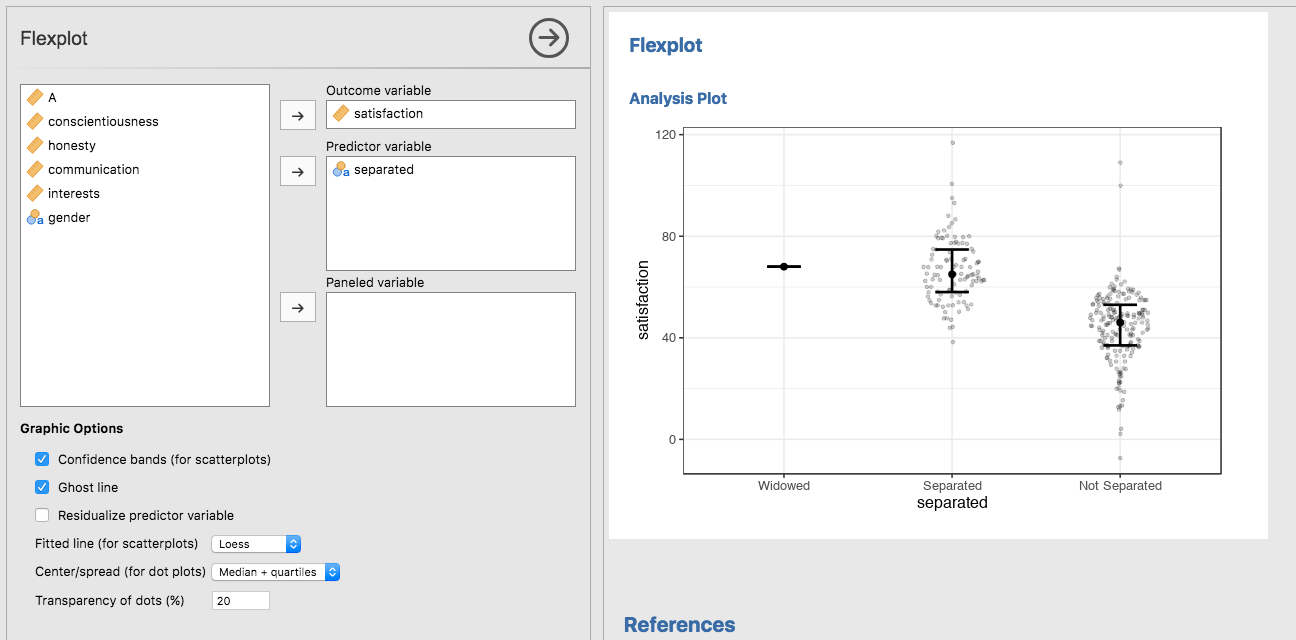
Now how about categorical on numeric? There’s several contenders, including boxplots, violin plots, standard error plots, etc. My plot of choice is what I call the “jittered density plot”, or JD plot. This graphic which shows the raw datapoints (jittered), but the jittering is proportional to the density. It’s kind of like a hybrid between a violin plot and a regular ole’ jittered dot plot. The image below overlays the median and the interquartile range:
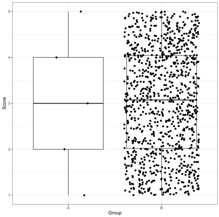
I like this better than the other plots because the raw data reveal so much more than the boxes (boxplot) or density curves (violin plots). For example, have you ever plotted a boxplot for a dataset that has 5 observations? It looks identical to one where we have lots of observations:
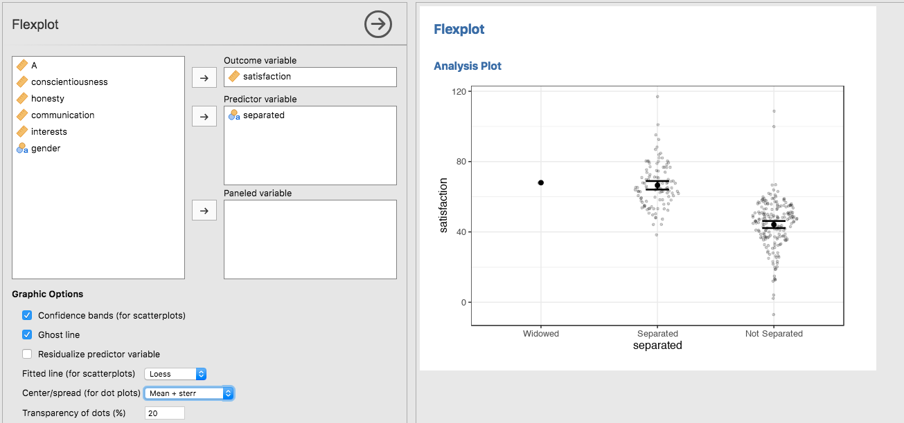
You could, of course, decide to plot means/standard deviations, or means/standard errors:
Multivariate Relationships
This is where flexplot really shines. And I mean REALLY shines. It shines so much, you have to squint to look at it.
(Too far?)
There’s a lot of decision-making that’s happening in the back end, and I’m not going to elaborate on the rules, but Flexplot will handle multivariate data with different colors/lines…
or the user can decide to panel by putting the second variable in the “Paneled variable” box:
But let’s go ahead and REALLY make this complicated by including three numeric predictors:
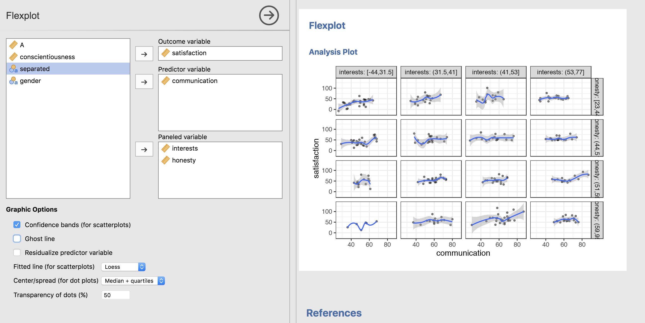
In the background, Flexplot is “binning” the two numeric variables and creating separate panels for each combination of bins. This is similar to William Cleveland’s “coplots”, with small modifications.
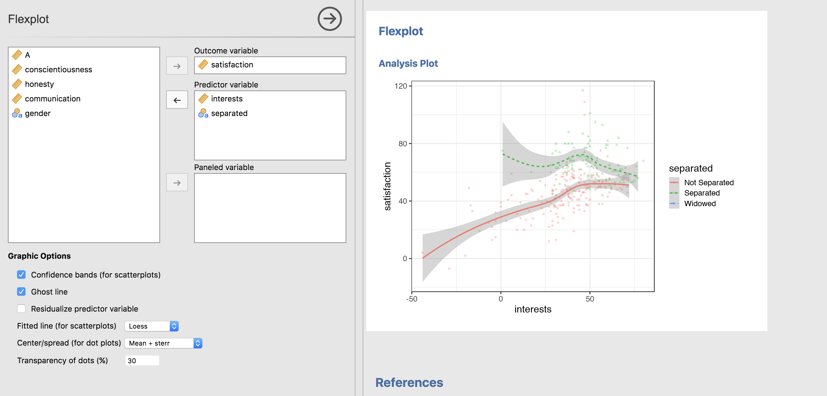
But that’s hard to see what’s going on. So let’s show a regression line instead of loess (the loess lines look pretty straight anyway) and remove the standard errors from the fitted lines:
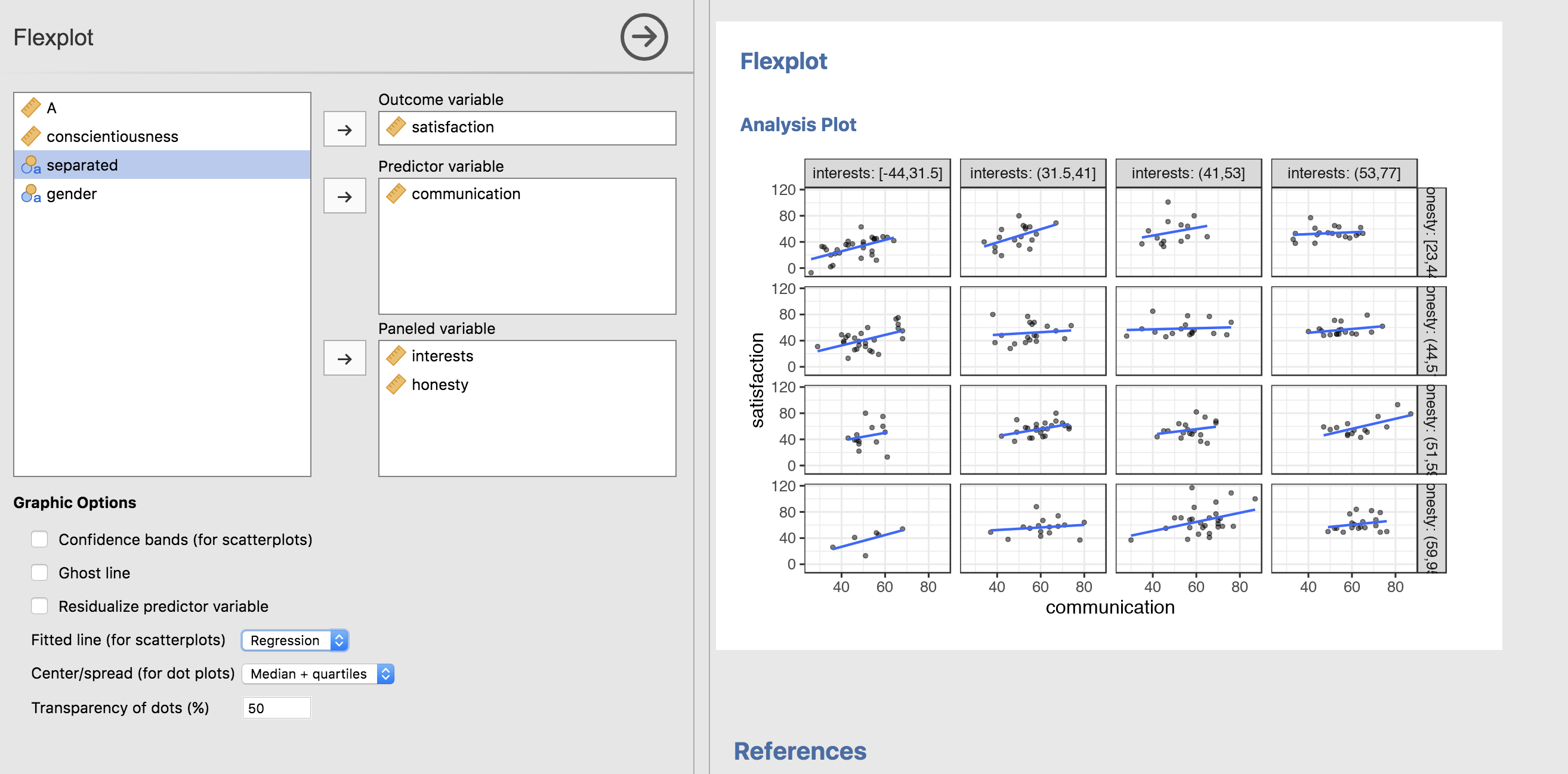
That’s better, but it’s still hard to see what’s going on. And this, my friends, is where ghost lines come in.
Ghost lines
Paneling is great. It’s an easy way to avoid overlapping of datapoints and they can make patterns clearer. BUT, then your eye has to travel further to make comparisons. That’s where ghost lines come in. Ghost lines repeat the pattern from one panel across the others:
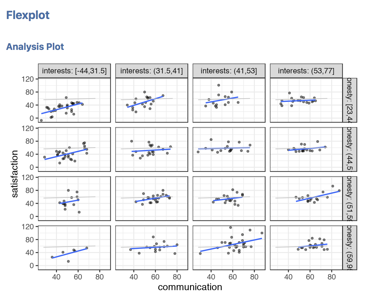
In this case, the gray lines are the “ghost lines”. This line is repeating the pattern from the second row, third column panel across all the others. Usually when I’m looking at multivariate relationships between numeric predictors, my first strategy is to try to dismiss the possibility there’s an interaction present. Interactions present themselves as non-parallel lines. With the ghost line, that becomes much easier to see.
(In the image above, the lines deviate a bit from parallel, but probably not enough to worry about).
Let’s go ahead and look at another example where ghost lines are quite beneficial:
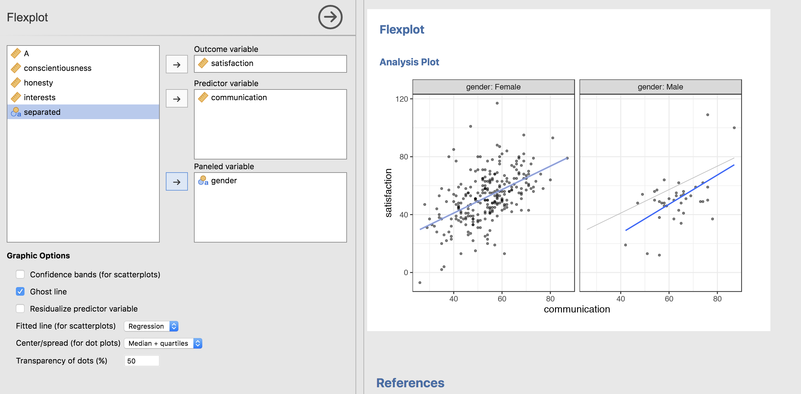
Here, the line for the female panel is repeated in the male pattern. That makes it VERY easy to see that males generally score lower on satisfaction than females, and that the relationship between communication and satisfaction is relatively consistent across genders (i.e., there’s little evidence of an interaction).
When there’s little evidence of an interaction, that makes plotting way easier. That means the effects are all main effects, and we can visualize them as bivariate relationships using added variable plots
Added Variable Plots (AVPs)
I don’t see these used much, and it’s quite a shame because they are ridiculously amazing. For those unfamiliar with AVPs, here’s the basic idea. Let’s say we want to see the effect of gender on satisfaction, after controlling for communication (like an ANCOVA). You can actually produce a plot that maps onto that concept. What you do is first fit a regression model predicting satisfaction from communication, then residualize it (in other words, subtract the fit of satisfaction from the actual satisfaction scores). This removes the influence of communication from satisfaction (unless there’s some nonlinearity or interactions present). We can then plot gender against the residualized satisfaction scores.
That’s how AVPs usually work, but in my experience, people tend to freak out when the scale of the Y axis doesn’t match the scale of the data. (Residuals will be centered around zero, instead of the mean of satisfaction, which, in this case, is around 50). To make these plots more digestible, I simply add the mean back into the residuals.
So, for this example, let’s go ahead and residualize the effect of communication. Clicking on the “Residualize predictor variable” checkbox will remove the effects of all variables but the last variable entered (in this case, gender):
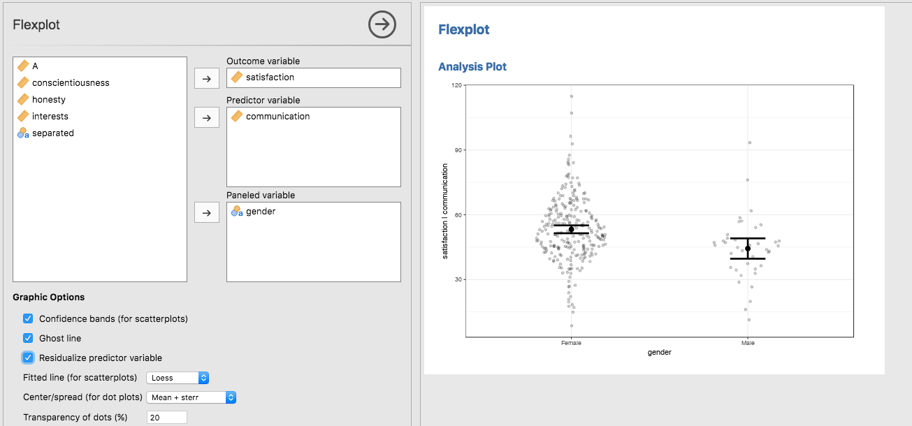
| That’s about as simple of a plot as you can get! Notice how the Y axis has changed from “satisfaction” to “satisfaction | communication” to indicate the DV has had the communication effect removed. |
Now, remember that complicated multivariate relationship between numeric variables? Let’s go ahead and plot that again, but this time with AVPs:
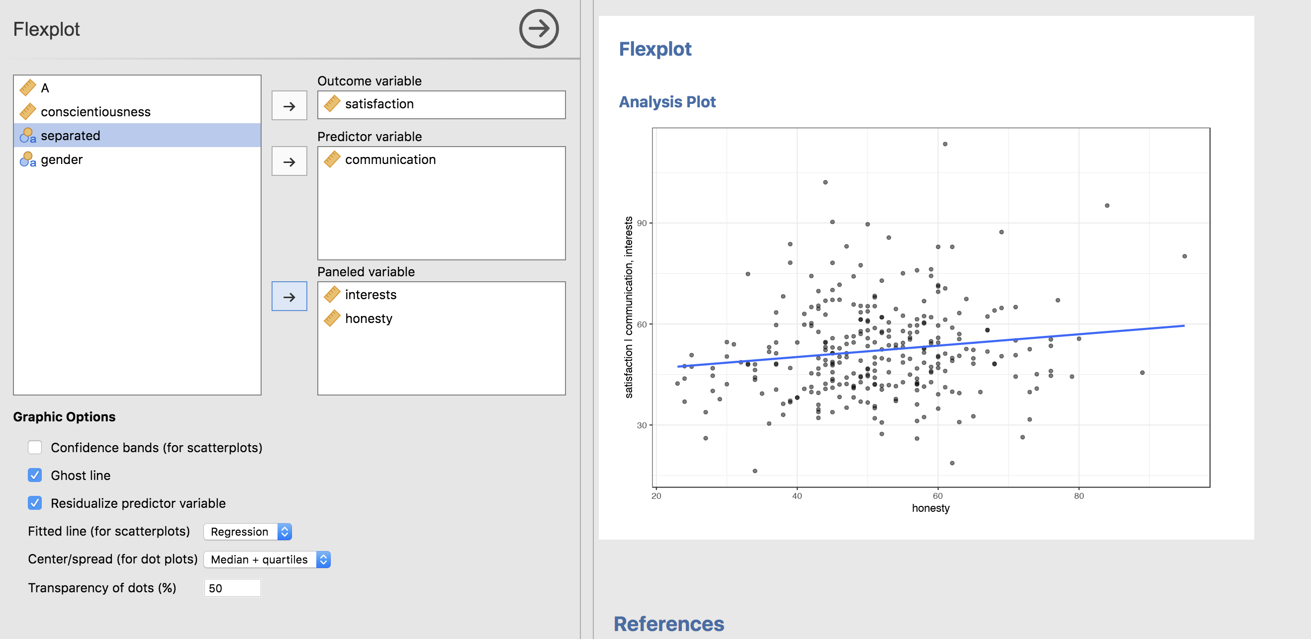
This is now showing the relationship between satisfaction and honesty, once we have removed the effects of interests and communication.
Let’s go ahead and study the main effect of interests (controlling for communication and honesty):
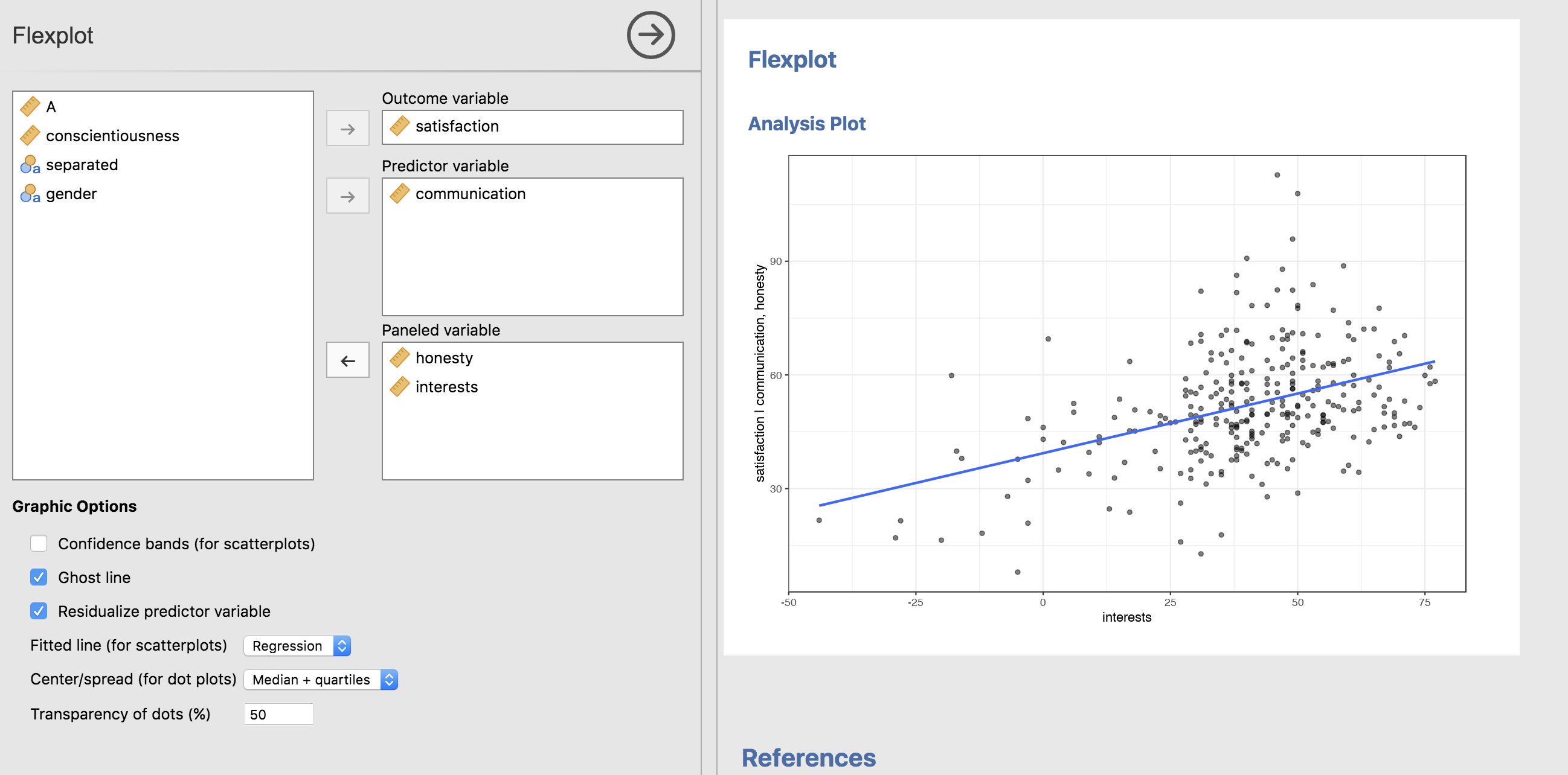
Interesting. It seems in this dataset, the variable interests is a stronger predictor of relationship satisfaction than honesty. (Couples that nerd out together, stay together).
By the way…these are simulated data. Please don’t use these results as an excuse to lie to your partner :)
I have just modeled my general strategy for plotting multivariate relationships: I put everything I can there at once with ghost lines. If the lines look all parallel, I then do added variable plots to study the main effects. All the while, I’m shifting views to try to gain a complete picture of what’s happening.
General Linear Model
Within the Flexplot module, there’s also another menu option called “General Linear Model.” The idea behind this is to combine the strengths of Flexplot with statistical modeling. By default, every statistical analysis will automatically generate a plot that attempts to visualize the statistical analysis. For example:
By the way, the motivation behind this represents the second guiding philosophy of flexplot:
Graphics are visual representations of statistical models. As such, the visuals need to match the type of analysis conducted. #Jamovi. #Flexplot
(Totally within the twitter character limit).
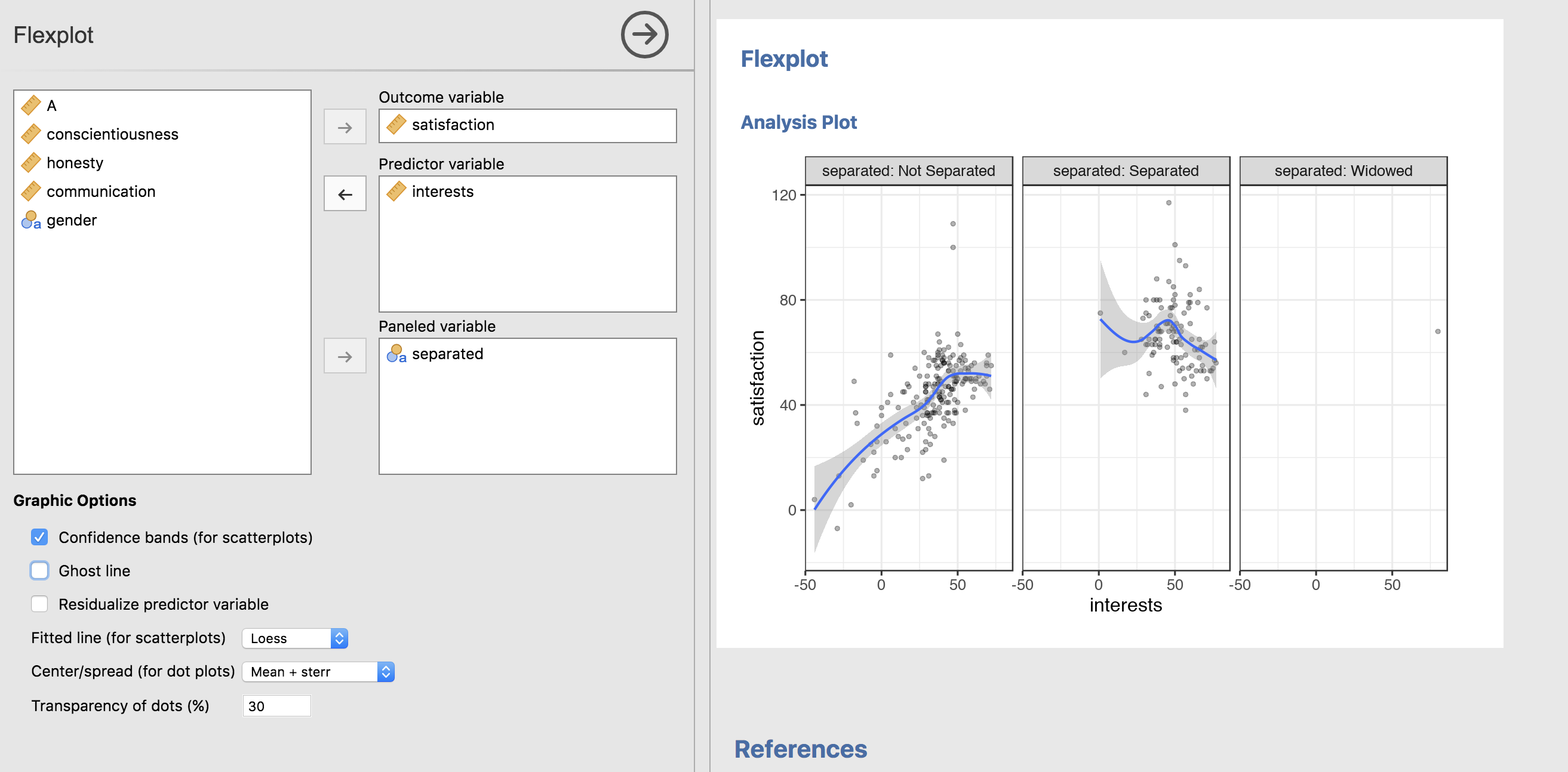
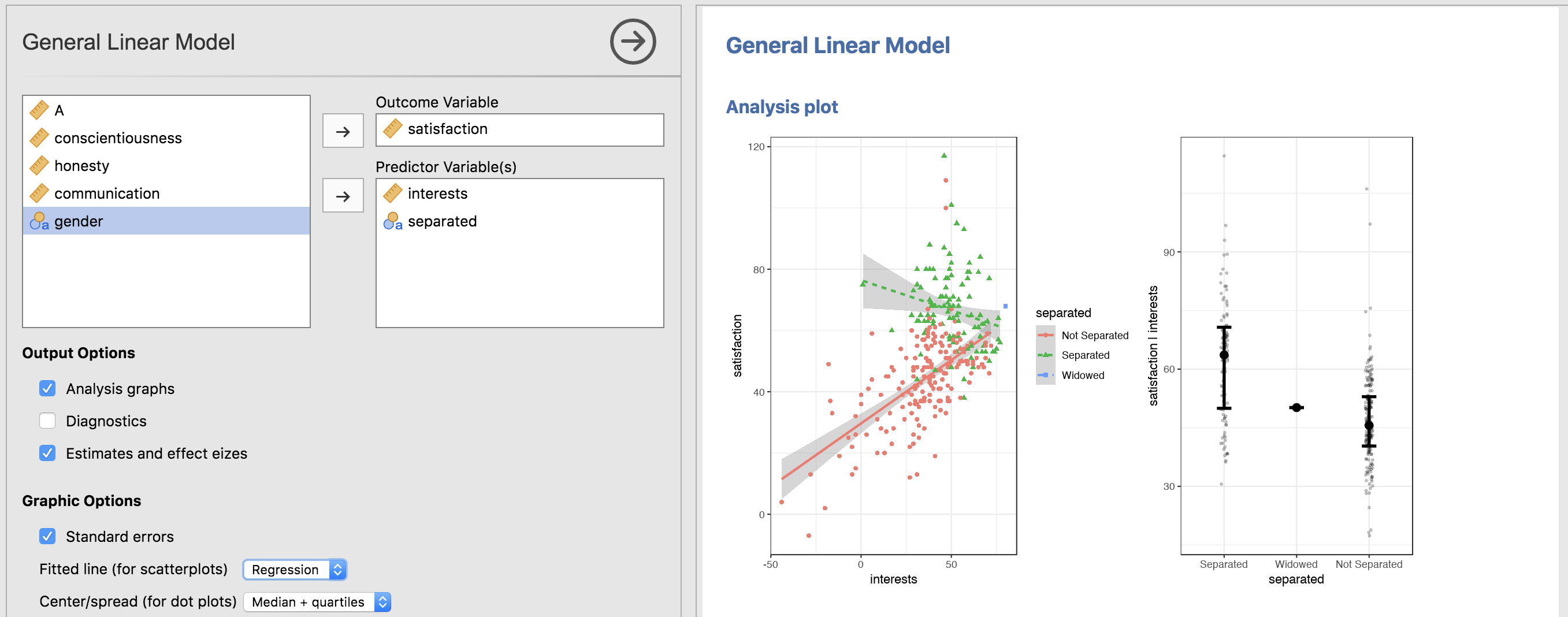
It would not make sense, for example, to show a boxplot (satisfaction against separated vs. not separated) when one conducts an ANCOVA because the Y axis of the boxplot has not been residualized; the AVP, however, will have it residualized, as shown in the right figure. BUT, the left figure shows an interaction present: the relationship between interests and satisfaction is negative for those separated and positive for those who are not separated. This shows that ANCOVA is actually not appropriate. (And it also means the right graphic should not be interpreted).
Within the General Linear Model section of Flexplot, with any multivariate relationship, the software will attempt to generate two graphics: one as an AVP and one showing all the data at once (often paneled). But, the graphic capabilities within GLM are a lot more limited than with Flexplot. Because of that, I recommend visualizing it in Flexplot first, then model the relationship.
We can also ask for diagnostic plots:
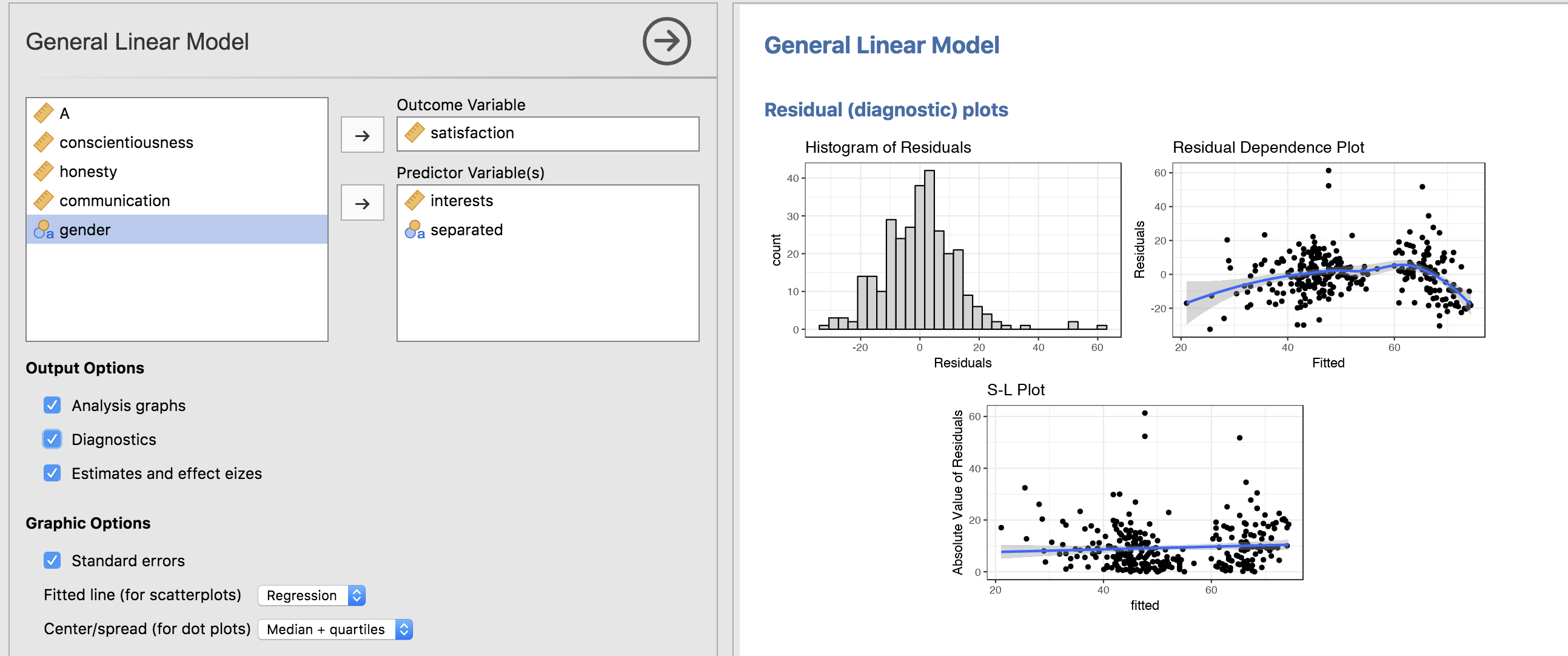
The analysis also comes complete with effect size estimates. By the way, you will not see any p-values in the GLM. This is for two reasons: (1) I don’t find them particularly informative, and (2) I am desperately trying to rid my students of the habit of looking straight at the p-values when doing an analysis.
Should you want p-values, I’d recommend you change your mind.
Otherwise, I’d recommend the GAMLj module.
Concluding thoughts
I may not be the best developer. I have no computer science background, I was self-taught, I use = instead of <- in R, and I prefer for loops to apply statements.
But I am active developer.
I personally find Flexplot extremely useful, so it’s in my best interest to make sure it functions well. Not to mention that my students use it. Rarely does a week go by that a student fails to catch a bug in the software.
Just look at my github account; I am frequently pushing new versions online and adding new features.
That’s both a good and a bad thing for you, fair reader. I anticipate that in a few months, the menus will probably look different than what I’ve presented. BUT, that also means that if you report a bug to me, it will probably be fixed within a week.
So, please do report bugs to me. I will appreciate it greatly.
As I mentioned, I have big plans for Flexplot in the future, including:
- the ability to modify various plot elements (e.g., theme, point size, point shape, axis labels, colors)
- adding additional nonlinear fits (poisson regression, exponential curves, etc.)
- the ability to visualize mixed models, time-series data, and structural equation models
I also have plans for the general linear model component, including:
- the ability to model interactions (I know, it’s a huge oversight at the moment, but these can be modeled in the R flexplot package)
- the ability to perform nested and non-nested model comparisons
“But Dustin,” you might ask, “how can I possibly keep up with your break-neck pace and revolutionary software modifications that will likely change the entire landscape of scientific research?”
I’m glad you asked, astute reader.
From time to time, I present modifications on my youtube channel: Quant Psych
You can see me there and I look forward to hearing from you!
Comments